This Christmas found me printing something I always wanted, but never had time to do for myself: Book Plates! Sometimes, these are referred to as 'Ex Libris' cards, or labels.
Ex Libris is Latin for "Out of the Library of". Book Plates are as old as the Book itself. It was created to mark the owner, in a day when books could cost anywhere from a months to a year's salary for a skilled workman or Professional. To loan a book was to lend a substantial investment. Figure that, say, Bailey's Etymology, a Dictionary from the 1730s (mine was printed in 1732) took a single printer about one year to compose, set, print, bind, and put into the sales line-up. In some cases books took several years to produce. Matthew Henry's Commentary took so much effort to print that Matthew Henry Himself took part in the process of printing it. As mentioned above, the price of such an item reflects the work that went into it (as well as the demand for it, which must have been likewise substantial!)
The Book Plate played the same role as a brand mark on cattle. There was no mistake who the owner of the book was. Any attempt to remove the Book Plate left disfigurement that made it obvious that a person's Book Plate was once there, and that the book itself may have been stolen. To put it in today's vernacular, lending a book was much like lending out your iPad 2. You sorta kinda would like it back.
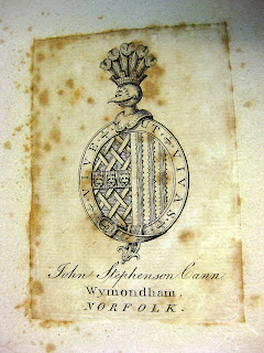
Book Plates were very personalized. Earlier examples were often very simple printed labels, typeset, with perhaps a decorative border. Many book collectors still prefer these types. Some featured a family's coat of arms, such as the plate on my 1807 copy of Walkers Dictionary, sporting the Plate of John Stephenson Cann, brewer of Wymondham, Norfolk, and owner of the Kings Head Publick House 1780 - 1840:

Others carried regular works of art, and were commissioned. In the latter 19th century and early 20th century, many notables of the day had commissioned Book Plates that reflected something about the owner. Masks of Comedy or Tragedy perhaps, if you were an actor. Artists, Scientists, Philosophers, Military Officers, Politicians, Musicians, notables of all walks of life....even silent screen actors.....used custom Book Plates to mark their libraries. And yes, some of these folks had very large, well appointed libraries. It was a very literary era. One that I find more imitated, rather than actuated, today.
My son in law, Zac, recent biblical studies graduate, mentioned his attraction for Ex Libris cuts and expressed a wish to one day have some for his own growing library. That was all I needed to hear. Dad-in-law happens to have a Letterpress Shop. How convenient.
I took for the central design a cut that dates to the 1640s. It had been modified when I found it. It is a zinc cut, in very good shape. The design features a Post Rider, known as a Postilion. His dress suggests Germany or Austria. His mount is fully loaded and he is announcing his arrival with what became known as a Post Horn, which became the symbol of the Post in many countries of Europe for centuries. In the upper left is the Arch Angel Michael announcing through a voice horn (fire masters used voice horns, predecessors to the megaphone, well into the 20th century to shout orders in the midst of a raging fire) - or maybe it's Gabriel playing a Sackbut. On the right is Hermes, representing speed, handing off a sealed message to the post rider. Possibly the world's first Air Mail delivery....
To the lower right we see townsfolk standing, hat in hand in a salutary gesture, awaiting the arrival of the Post. Under the horse we see grave markers, broken impliments of war, and to the lower right we see a ship sailing into a serene and calm harbor. We find flags mounted from a church steeple, from ships' masts. All of these were symbols of things that marked everyday life. Remember, this illustration was cut right at the end of the Thirty Years War, which ravaged Europe. Death, War, Pestilence, invading armies, all determined your circumstance in the realm of things Temporal. The Post Rider carried not only the mail: he was the Six O'Clock Evening News! He was your connection to the outside world. Not many newspapers were in circulation then, that would wait for another generation or so. Hence, the post rider became symbolic for not only news from home, but news from around the world.

This is a bit of detail. The image is 3.5 x 2 inches. The original illustration was a wood cut. This is a "Zinco" from the original, date unknown. My guess places this cut around 1920. Note the retention of some rather fine lines. I've seen the original cut, and have noted there were some editing that went on with this particular cut, but nothing significant. I chose this cut for the "News" theme. I like to think in terms of "Good News". The news that Christ had come to rescue men from their certain and tragic fate. News that God had so loved His Own that He gave His only son to be delivered for our transgressions and to be bruised for our iniquity. This, Charlie Brown, is the meaning of Christmas.

Featured above and below the central cut are foundry cast crowns, from one of my traditional/18th century border fonts, using 18 pt. Lombardy. I am not sure of the name, the type trays that contained these fonts were donated, and date to approximately 1900. I carry these as a titling font, from 18 to 36 point, stored in home-made trays. Home-made, I assume, by the prior owner. The Crowns are courtesy Quaker City Type Foundry, Honeybrook PA.

Here is a close up of the lower portion. The impression is classic 'kiss', that is, enough pressure to adequately transfer the ink from the forme to the paper. The paper itself is a discontinued vellum. I chose this paper because of all the stock that sports the name "vellum", this paper actually has the look and feel of flesh-side vellum. It has very nearly the same translucency and general conformation, although the grade is thinner and much more even in thickness. It is slightly thicker than text weight, but no where near card stock. It was a close-out item at my Orlando supplier, and I grabbed the one remaining ream. I've been picking at it very slowly over the past two years.

My packaging was inspired by fellow blog-spotter
Luis Seibert. My package is made from the same vellum as the cards, cut by scissors and sealed with a Letterpress Christmas Seal, the Centennial Commemorative of the first American Christmas Seal designed by Emily Bissel, 1907, for the National Red Cross. I issued these in 2007 and in 2008 from the Florida Pioneer Settlement for the Creative Arts. Printed in sheets of 12, they are the only commemorative seal that I know of. The design is taken from that very first "Merry Christmas" seal. I thought it appropriate to use it to seal this little 'stocking stuffer'. A cranberry ribbon surrounds the sides, held in place by 3M two-way framer's tape.
Here's a bit of a closer view of the Ex Libris package and seal. Making the package was a project in itself. If I decide to package Book Plates like this all the time, I will be designing a die to make the cuts. That will speed things up tremendously.
Here are a couple shots of the ribbon around the sides. Added a nice touch. It would have been really classy to have a wax seal made. That would require some sort of monogram design on my part. But . . . . that's another project for another day.
So, in conclusion, the specs:
Size: 3.75 x 2.625 inches, horizontal orientation
Paper: Magna Carta Parchment "Coachlight" vellum finish, 60 lb, grain: long.
Inks: Kelsey Brown, tube, mfg 1980 ; Black, "Ink in Tubes"., purchased this year.
Type: 18pt Crown ornaments, monotype, Quaker City ; text: 18 pt. Lombardy, foundry: unknown
Center cut: Zinc, 3.25 x 1.75 inches, hardwood base, mfg. unknown, age unknown.
Availablilty: upon request. E-mail wd4nka@aim.com
That's it for now. Good Providence in your continued Holiday observation, and a safe, prosperous New Year!
-gary.


