Monday, August 13, 2012

Combining Work with Pleasure, Installment No. 2


Welcome to installment number two, "Combining Work With Pleasure".  The work: making some of the most awesome cards that rolled off our 1936 New Series C&P Letterpress yet!  Golly, the last month saw awesome calligraphy from a world class Calligrapher, and now we are tripping back to the 1880s with genuine Eastlake tatted borders, bunted frames, and knotted lace.  Look at the blind debossed borders on the finished invitation!  Rebekah wanted some engrossed flourishes around her and Alton's name, so I went back to 1690's Londontown to borrow some penwork from Ayers, which wove nicely into the Script (Bickham Script) and flowed with the inclination and kerning of the characters.


This is the die and print.  The die is courtesy Owosso Graphics, magnesium, wood mounted.  I prefer metal dies over polymer largely owing to the crisp edge nature of metal.  Also, I am a traditionalist.  At one point I will probably start using polymer, but so far I haven't seen the huge advantage it has over traditional wood mounted metal.  As mentioned in the prior installment, the die used for the blind deboss is 16 gauge copper, also wood mounted.


The following shots are close-ups of the invitation and the obverse of the RSVP Post Card.  The ink chosen is straight-out-of-the-tube oil based brown, from "Dave's Ink In Tubes".  What we were not prepared for was the effect of this standard brown against pearl white Lettra: Gold.  Not bright and shiny, but a dense Florentine.  The combination of a debossed image in this colour, the saturation, the shadow cast by the deboss, ever so slight, and overhead lighting produced a remarkable visual!


The deboss of the border was heavy enough: we did not wish to punch the text.  The open fibre nature of Lettra permits the die to sink into the stock's surface just a bit, by its very nature, thus what you have is a nicely planted text line with a solid presence, yet not heavily punched.


A close-up of the flourishes of Mr. Ayers, Scripsit to King Charles II.


Text on the lower part of the Invitation face. 


The use of Postal Card RSVPs is gaining popularity, and the Rebekah / Alton team are no exceptions.  The idea is to save money, both on postage and on having to purchase RSVP envelopes with return addresses.  Much as I'd love to take your money, part of my mission in Letterpress is to make it as affordable for you as possible.  Post Card RSVPs are a great cost-cutting alternative.  The reverse side will be printed as well.


Close-up of the message side.


I used some of the same flourishes as appears on the Invitation.


The border is printed within one thirty-second to one sixty-fourth of an inch to the edge.  It was verrry tricky to feed. While the border carries the same basic design elements of the Invitations, they owe much more to my background in Stamp Collecting (Philately), in that many of the 19th century classic postage stamps used the eyelet lace motife for borders.  In particularly, the Letterpress printed postage stamps.  Proving once again that if you want some great classic design ideas, go to your local Stamp Collector.


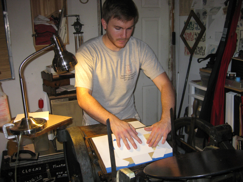
Ahh, yes.  The couple, checking out Alton's handiwork, my latest "apprentice". (grin)


"Uhh....doesn't "November" have an "r" at the end of it?"


"Just kidding!!"

Whew!  Don't scare me like that!

And now, set back, grab some pop-corn, and enjoy our latest little vid: Alton Punches Paper with 1200 pounds of iron in motion!


That's it for this installment.  Stay tuned for the next installment, when Alton says "Hmm....I wonder if I can crush pennies. . . . . ?

-gary.


Tuesday, August 7, 2012

Combining Work With Pleasure


One of the unique features of having a Letterpress Shop, even a hole in the wall like mine, is that you can do things other folks can't do.  Like, for instance, how many of y'all made your own glasses? (Opticians don't count!)  

Last night we began the final process of producing Alton and Rebekah's wedding stationery.  This was wholly their design, they just told me where they wanted what stroke to be put where.  Alton and Rebekah are no slouches in areas requiring imagination, creativity, and design.

The initial design unfolded with the idea to create an inner envelope liner made from paper lace.  Having secured a sample, I based the debossed border design after the basic lace pattern.  The result produced an almost Eastlake Victorian design with enough filligree to compliment the text, which will contain flourishes sampled from the work of Ayers, who was an English Scribe of the 17th century.  I tried to do the flourishes myself, but frankly, I don't have that kind of hand these days.  That's why I stick with Blackletter.

The lace design is nestled in the corners, with repetitive elements serving as borders between the corners, again, themed from the central lace design.  The design is "blind debossed" onto a 5x7 vertical card, forming a delicate and very pleasing dimensional visual.

After a very tricky set up (we are using a margin of less than one sixteenth of an inch all the way around the border!), we began the process of debossing from the copper die, courtesy Owosso Graphics, with the press set on it's slowest speed.  It was somewhat tricky to 'feed' this set-up, but after a while, we were up to about one impression every three seconds.  For this sort of thing, not too shabby!  Alton, the groom-to-be, wanted to give it a try.  Very soon, he became an old hand at this.  But then, I know Alton: it was a cinch he would acclimate to my press quickly.  Below is a sequence of Alton feeding my 8x12 Gordon.


Firt off, Alton "fans" the stock.  Would you believe that 'fanning' is one of the hardest things for me to teach at a workshop?  Fanning is a way of spreading out the stock for feeding and / or counting.


He gently slides the card into the paper guides I rigged up on the tympan.  I could not use my standard gauge pins for this part of the edition because the edge of the paper is nearly flush with the edge of the die itself.


Ensuring the card is properly placed, Alton reaches for the impression lever and makes the impression.


Ahh, yes.  There is is.  Ready to repeat the cycle.

The debossing of the border with "clients" on hand became a type of workshop that I do not always have the opportunity to enjoy: having the client actually take part of the production, with their hands on the Helm, as it were.  It was fun to watch and participate.  Rebekah, not in the photos, was standing on the opposite side of the press watching.  It was just as fun watching her amazement and fascination with the process.  Alton later told me the most important part of the night was the idea that came home with each impression: "Wow, this is really happening!!"  Yes, Alton, it is really happening.  And we are so glad that your Sovereign led you two to each other!

So, what does the design look like?   I took a few shots using a lamp that was recommended by Kim Austin, of Austin Press, San Fransisco, although I have yet to have room for the light tent and set-up. These photos were shot with my sweet wife Cindy's Canon Sure-shot under a 6500k lamp:


Can you see how close to the edge we are making our impression!  There is only one-thirty-second of an inch all the way around.  Beyond set up, there was no waste.  Good going, Alton!!
. . . yeah, that's an I-Hop cup.  Don't even ask . . . .


As we proceed with this unique order, I will keep you posted.  As for the design, I will be making this available as one of my border choices available through G. Johanson, Letterpress.  We are naming it after the Bride to Be: Rebekah.  If you like this design, ask for the "Rebekah" Eastlake border.

Stay tuned!

Good Providence in ALL your endeavours.

-gary, the Printer.